
A single letter can turn a manicure into a signature.
Not a trend. Not a temporary decoration. A quiet claim of ownership that sits on your hands every day.
Nails With Initials work when the letter feels intentional — the right font, the right placement, the right amount of restraint. They fail when the initial looks stamped on instead of designed in. This guide is the difference.
Fourteen personalized designs. Each one names the style, the best placement, how to wear it, and the one detail that separates “cute” from “I need that.”
Save this to your Pinterest boards for the next salon visit, and follow us on Facebook so the next design drop never misses you.
The Initial Rules (Read This First)

Three decisions decide whether initial nails look expensive or amateur.
1. Font is everything.
Thin serif and delicate script read quiet luxury. Bold sans-serif reads graphic and modern. Script with heavy flourishes ages fastest. Ask for “thin” or “delicate” every time.
2. Placement beats size.
One perfectly placed initial almost always looks better than initials on every nail. The ring finger, the accent nail, or a single side placement keeps the design elevated.
3. Negative space is your friend.
The more empty space around the letter, the more expensive it looks. Crowding the initial with glitter, chrome, or too many details is the fastest way to make it feel cheap.
These fourteen designs follow those three rules.
The 14 Personalized Designs
THE QUIET LUXURY FAMILY (1–4)
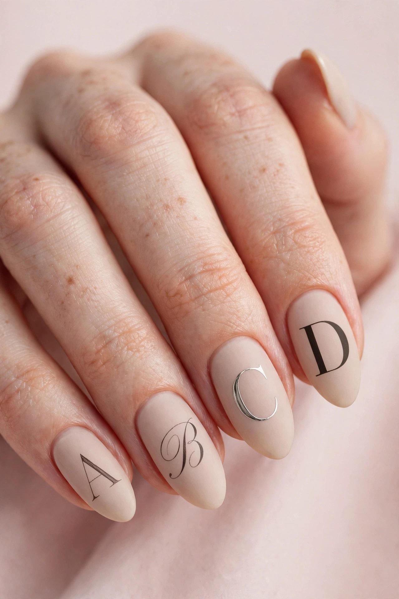
1. The Single Serif Accent

The Style: One thin serif initial on the ring finger only, everything else nude or soft milky.
Best For: Everyday wear, office, women who want personalization without shouting.
How to Wear It: Keep the rest of the set completely clean. Let the letter be the only detail.
The Note: This is the most requested quiet-luxury initial look for a reason — one letter is stronger than five.
2. The Side-Script Whisper
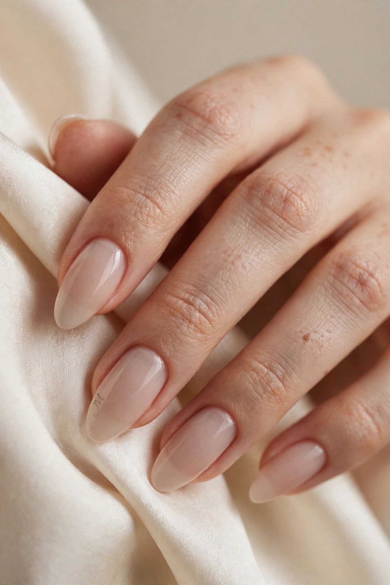
The Style: A delicate script initial painted vertically along the side of the nail, almost hidden until the hand moves.
Best For: Women who want something private and personal.
How to Wear It: Best on almond or soft coffin shapes. Pair with a sheer neutral base.
The Note: Side placement is the most underrated way to wear initials. It feels like a secret.
3. The Monogram Nude

The Style: Two or three interlocking initials in an ultra-thin serif on a creamy nude base.
Best For: Brides, new moms, women who want their partner’s or child’s initial with their own.
How to Wear It: Keep the monogram small and centered on the ring finger or both ring fingers.
The Note: Interlocking letters only work when the font is extremely fine. Thick fonts turn into blobs.
4. The Old-Money Initial

The Style: A single classic initial in deep burgundy, chocolate, or soft black on a glossy nude.
Best For: Fall and winter, women who already lean toward quiet luxury.
How to Wear It: Match the initial color to a lipstick or bag you already own.
The Note: Dark initials on nude bases photograph richer and age better than light initials on dark bases.
THE MODERN & GRAPHIC FAMILY (5–8)
5. The Bold Sans Accent

The Style: One strong, clean sans-serif initial on a single nail against a solid color.
Best For: Women who like clean lines and modern minimalism.
How to Wear It: Works especially well on short square or soft almond nails.
The Note: Sans-serif initials feel current longer than script. They also survive daily life better.
6. The Negative-Space Letter
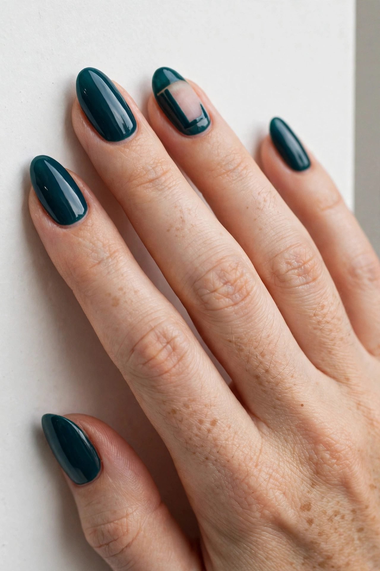
The Style: The initial is left as negative space inside a solid color or soft chrome.
Best For: Statement sets that still feel refined.
How to Wear It: Best on medium-length nails so the letter has room to breathe.
The Note: Negative-space initials look expensive because the letter is formed by what is missing, not what is added.
7. The Micro Initial Row
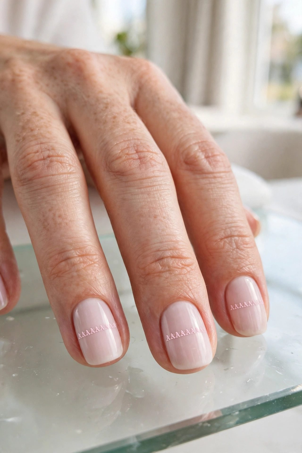
The Style: Tiny matching initials repeated across two or three nails in a single straight line.
Best For: Minimalists who still want repetition.
How to Wear It: Keep the size almost impossibly small. One wrong scale and it looks busy.
The Note: Micro is harder than it looks. Tell your tech “as small as you can go while still readable.”
8. The Chrome Outline Initial
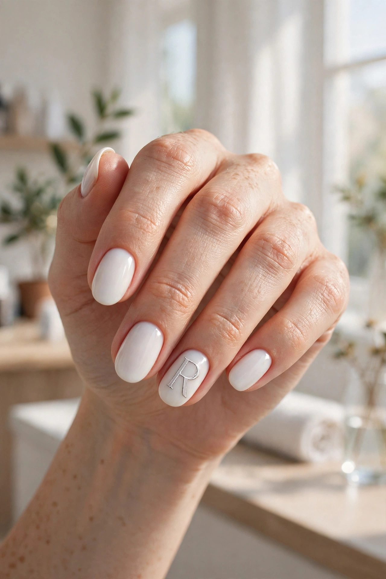
The Style: A thin chrome or silver outline of the initial on a soft neutral base.
Best For: Women who love a little light reflection without full chrome nails.
How to Wear It: Pair with milky white or soft beige. Avoid heavy glitter.
The Note: Outline-only chrome initials catch light beautifully in photos and still feel wearable every day.
THE ROMANTIC & SOFT FAMILY (9–11)
9. The Script Heart Initial
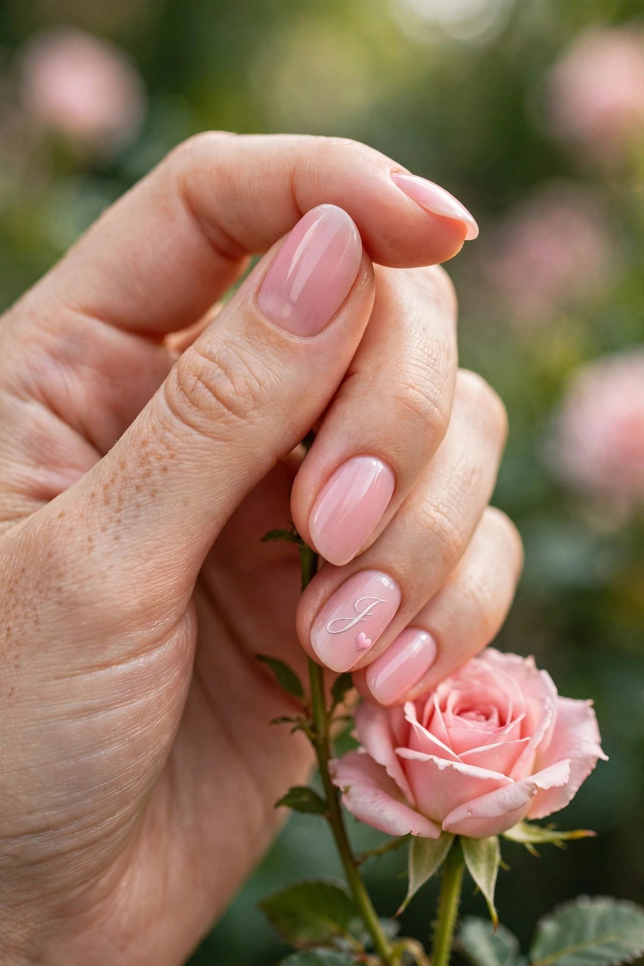
The Style: A delicate script initial with a tiny heart detail integrated into the letter or sitting just beside it.
Best For: Valentine’s, anniversaries, or soft romantic sets.
How to Wear It: Keep the heart extremely small so it does not overpower the letter.
The Note: One tiny heart is romantic. Multiple hearts become juvenile fast.
10. The Soft Glitter Initial

The Style: A fine script initial filled with soft, fine glitter instead of solid color.
Best For: Evening events, date nights, bridesmaids.
How to Wear It: Use champagne, soft rose, or pale gold glitter — never chunky.
The Note: Fine glitter reads elegant. Chunky glitter turns the initial into costume jewelry.
11. The Dual Initial Romance
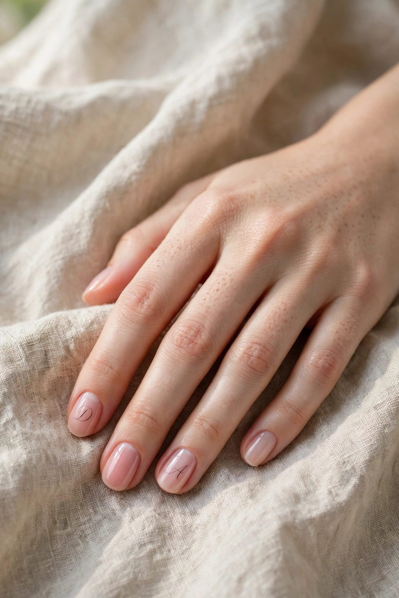
The Style: Two different initials (yours and someone else’s) placed on separate accent nails in matching thin script.
Best For: Couples, best friends, mother-daughter sets.
How to Wear It: Keep both letters the exact same size and font weight.
The Note: Matching font weight is more important than matching color. Uneven letters look accidental.
THE STATEMENT & EVENT FAMILY (12–14)
12. The Full-Set Monogram

The Style: The same monogram or initial repeated across every nail in a very fine weight.
Best For: Brides, special events, photoshoots.
How to Wear It: Only works if the letter is tiny and the base color is calm.
The Note: Full-set initials succeed only when the letter is almost whisper-thin. Anything heavier becomes overwhelming.
13. The Black-Tie Initial

The Style: A sharp, high-contrast initial (black on white, white on black, or deep red on nude) with perfect edges.
Best For: Formal events, black-tie, important dinners.
How to Wear It: Choose a high-contrast combination and keep every other nail completely clean.
The Note: Contrast is what makes this look powerful. Soft contrast loses the impact.
14. The Birthday or Milestone Initial
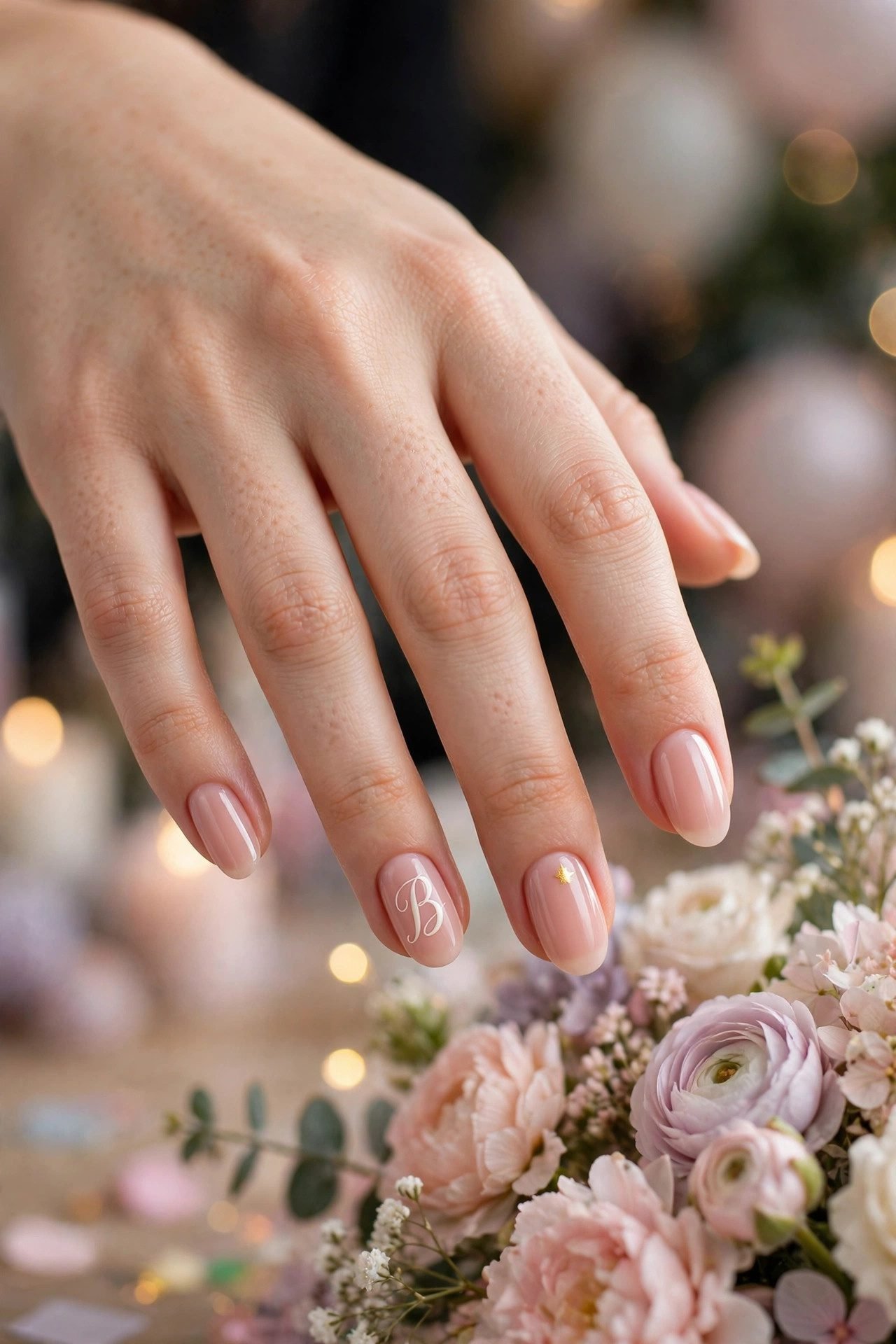
The Style: One beautifully painted initial paired with a tiny number or symbol (age, year, or small icon) on a neighboring nail.
Best For: Birthdays, anniversaries, personal milestones.
How to Wear It: Keep the extra element smaller than the initial so the letter stays the hero.
The Note: The initial should still dominate. The number or symbol is supporting cast only.
How to Make Initial Nails Last and Look Expensive

- Ask for the initial to be hand-painted or precisely stamped — never thick vinyl that sits on top of the nail.
- Choose a base color you already wear often. The initial should feel like an extension of your regular style, not a costume.
- On short nails, go smaller and simpler. On longer nails you can afford slightly more detail.
- If you are between fonts, always choose the thinner option.
- Aftercare matters: use cuticle oil daily. Dry cuticles make even the most beautiful initial look neglected.
For the health of your natural nails underneath, follow a solid nail care routine. When it is time to change the set, remove them properly — never peel.
Nails With Initials FAQ
What is the most flattering placement for initials?
The ring finger accent or a single side placement. Both keep the design elevated and wearable.
Do initials look better on short or long nails?
Both work. Short nails look best with tiny, clean letters. Longer nails can handle slightly more delicate script.
Should I put initials on every nail?
Only if the letter is extremely fine and the rest of the design is very quiet. Most of the time, one or two accent nails look more expensive.
What font should I ask for?
“Thin serif” or “delicate script.” Avoid heavy or overly decorative fonts unless you are going for a specific graphic look.
Can I wear initial nails to work?
Yes — especially the quiet luxury versions (single serif, side script, monogram nude). They read as intentional rather than trendy.
How do I keep the initial from chipping or fading?
A good top coat and daily cuticle oil. Avoid using your nails as tools. Proper removal also protects the design for its full wear time.

For more ideas and inspiration like this, save your favorites to our Pinterest boards and follow us on Facebook for fresh posts every week.
Final Word
Initial nails are not about following a trend.
They are about claiming a small, permanent piece of your own style.
One letter.
The right font.
The right placement.
That is all it takes.
Save the designs that feel like you to your Pinterest boards so they are ready the next time you sit in the chair. And if you want more nail inspiration that actually lasts past the first week, explore the full nail designs library and the cleanest french tip ideas, chrome looks, and short nail designs we have.
Your initial is waiting.